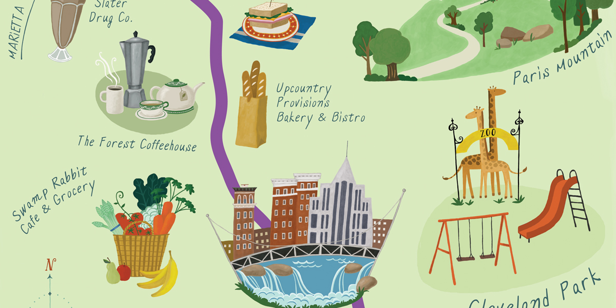
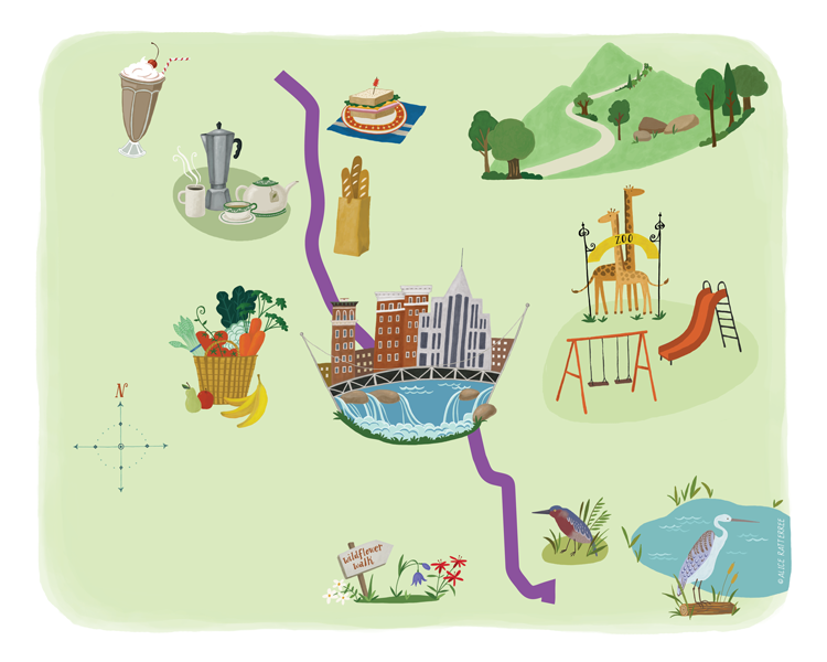
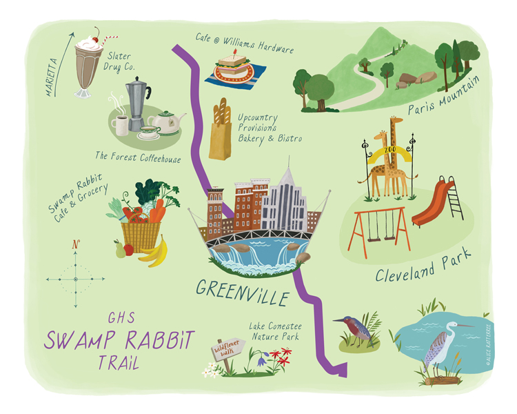
Recent editorial work for Town Magazine involved an illustrated map of the Swamp Rabbit Trail.
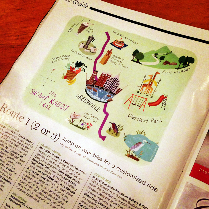
The process, while brand new to me, proved to be very rewarding. It began with a conversation with the editor, in which she provided the key places along the trail that would be highlighted. Initial (messy) notes:

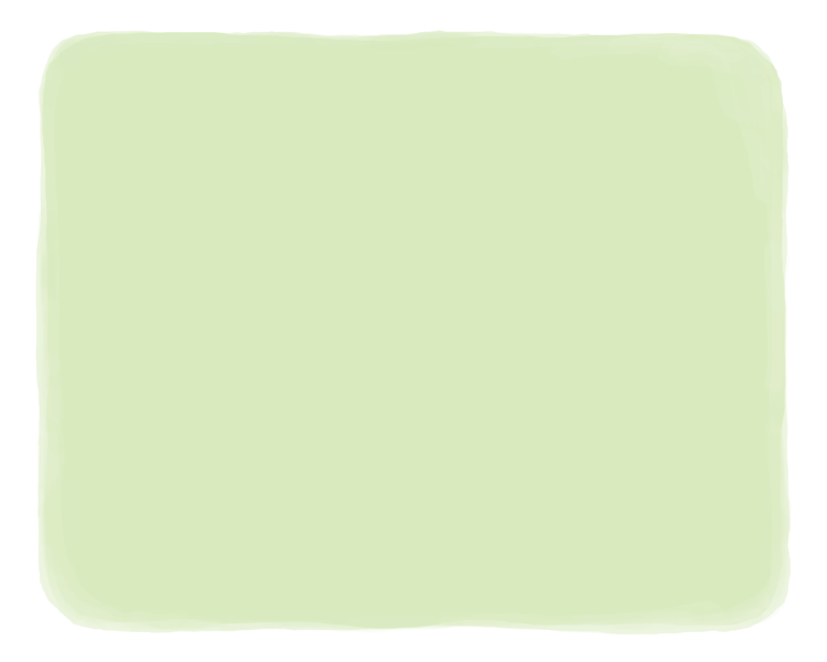
To start, a soft-green base was laid in Photoshop using the paint tools.
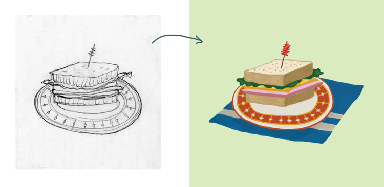
Each location needed a special icon that represented its unique services and attributes. Time is always a constraint with editorial turn around, so I didn’t have the luxury of personally seeing places I wasn’t already familiar with. But it was a lot of fun virtually “visiting” each enterprise’s web site and discovering what it had to offer. I wanted each location’s icon to have a very hand-made look to it, so instead of drawing directly onto the computer, each icon was free-handed (just on plain printer paper- one of my most used and favorite sketching surfaces!) scanned it in, and then traced over it in Photoshop with the paint tool (as a separate layer – that way, the original drawing could be deleted). The result was something like this:
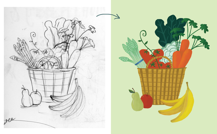

And so on…..
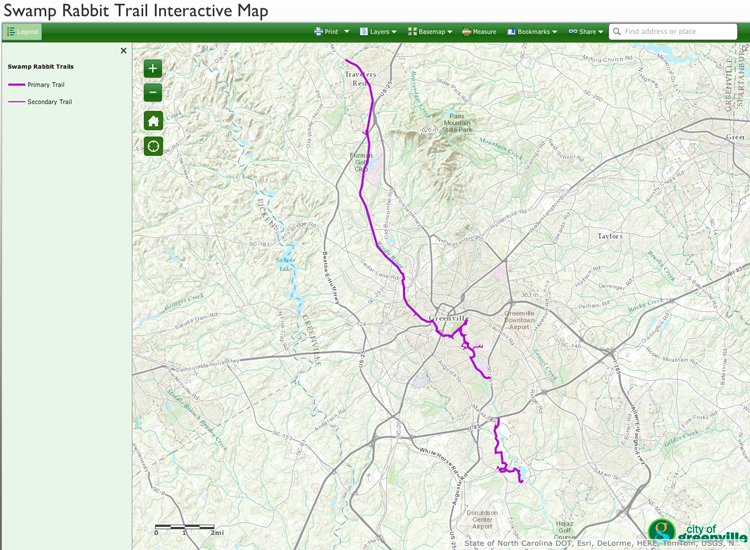
Next task was to add the actual trail. It needed to be accurate, but also a hand-made representation. Thanks to Greenville County Rec‘s interactive map of the trail, the perfect model presented:
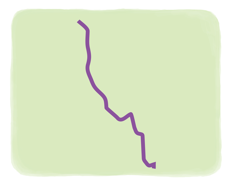
I liked the way the bright purple stood out against the earth tones, so I picked a similar bright purple to work against the green foundation I had chosen. The trail had to be simplified somewhat but still have those organic angles. This was traced and simplified in Illustrator then imported as a smart object into Photoshop:
Each icon had been created in its own layer, which allowed me to move them around individually. The interactive map had a feature that allowed me to type in the address of each location and view it in relation to the trail. That gave me the basic vicinity for placement.
The next layer was choosing typeface. Thanks to MyFonts I chose one that represented the hand-letter quality to work with the image….
Along this topic, Laura Coyle has written this excellent blog post about how she designs and illustrates maps, which is a specialty of hers.
Illustrator of the day: Laura Coyle!
Leave a Reply
You must be logged in to post a comment.